
Neil Wetenkamp
Repositioning the Funnel
Content Design Document for the Verizon Project
Role: Content Designer, UX Designer
Timeline: 7 days
Project Overview:
The project began with a real problem that faced the consumer website for verizon.com and its mobile plans page. At the time of this study, the problem still faces the company.
From the Content Design Document
Project: Verizon.com, mobile plans onboarding page
Created by: Neil Wetenkamp
- Introduction and Overview
Context:
Telecom giant Verizon relies on its website to bring in customers, and despite a steady influx of direct web traffic, has not captured a dominant place in the mobile plan market.
Problem to Solve:
Users are distracted by the current design, and already weary from competitive shopping, are easily frustrated by the interface. Low engagement and low click-through rate (CTR) results in lower sales. Of the top 3 telecom companies in the US, Verizon has the lowest traffic numbers despite comparable offerings.
Solution and Scope:
Improve content and interaction on the mobile plans page (https://www.verizon.com/plans/unlimited) to increase engagement and retention.
Content Goal:
Improve the content flow of the mobile plans page to increase accessibility, usability, and improve funneling of customer segments toward mobile plans.
An improved content flow will be followed by an adjustment in UX in separate documents.
2. Audience and User Needs
Target audience:
The audience for this content change are users seeking changes to mobile service. The demographics are wide (mass market), with larger segments in adults aged over 30.
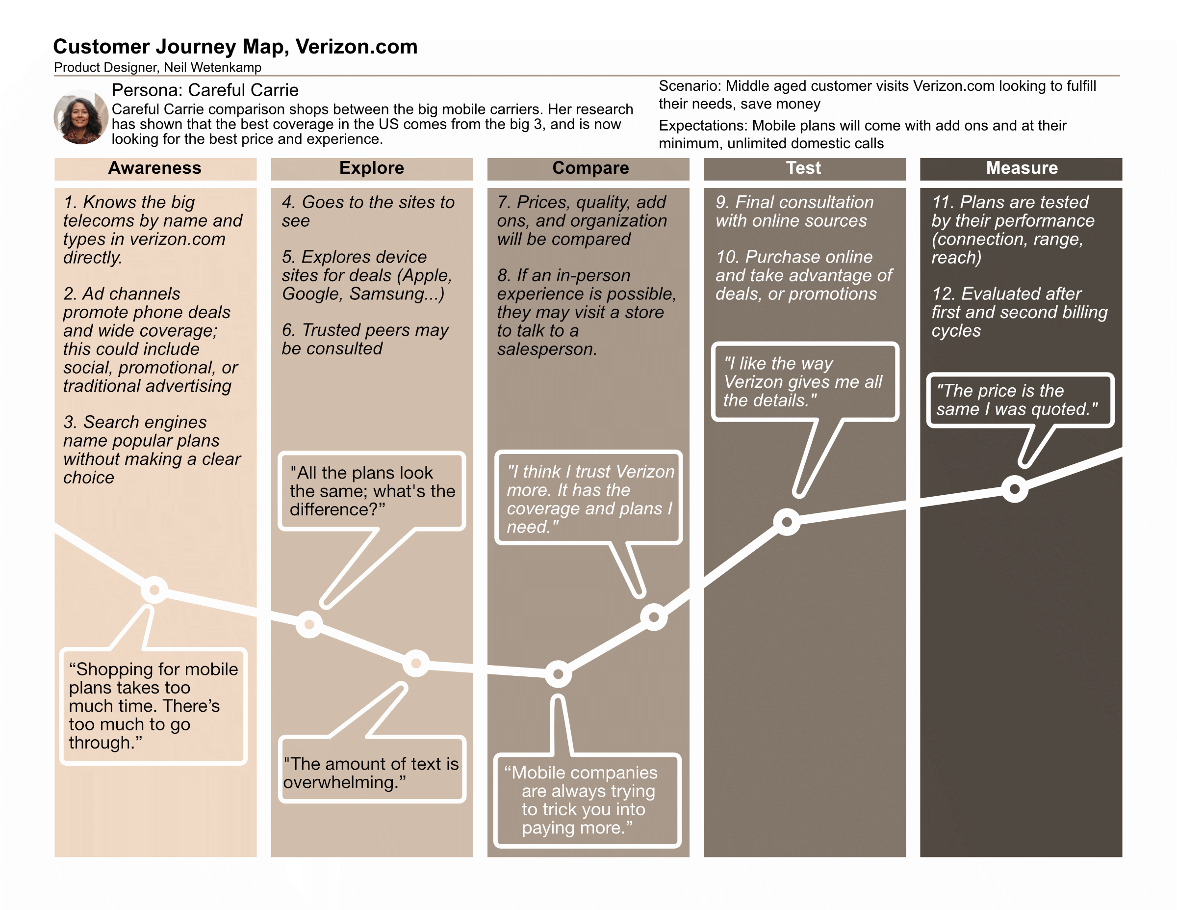
An attached CX journey shows desired outcome for the content as well as pain points from user research.
Other considerations included:
- 32.7% of traffic to Verizon is from the desktop1
- Peer competitor ATT has 25% more web traffic
- Users are more likely to be older, near metros, and use their mobile devices for video content2
- High growth areas do not include California metros2
- Other users span domestic groups, in wide demographics
Content fits into the user experience in several ways. One, it leads customers toward choices with headers and CTAs. Two, it explains differences and benefits in captions and bullet points. Thirdly, it promotes a tone.
Scenario 1: Simplfied
Samantha Mochiwa is an urban office worker that has recently realized her son needs a phone too. Dealing with the unmistakable change in her son’s age, she wants a multi-line plan that saves the family money while offering high speed service. She finds the wordy advertising of some telecoms irritating, and is drawn to simpler, more straightforward content.
Scenario 2: Honesty
Louis Brand is a college student in a remote college, and needs good coverage. Though young, he’s seen how mobile plans can trick you with what they promise and wants an honest deal from a big provider with good coverage.
Edge Cases
Some edge cases to consider are cases where the user has limitations in language (alternate primary language, accessibility issues), or in environmental restrictions (limited time (work, school, schedule), light conditions, limited web access).
3. Content Strategy
Key messages and Tone:
Core messages should include the idea that Verizon is trustworthy, upfront, and full of value; users should see how they can save through the content.
Content types:
Microcopy (CTAs, buttons)
Help text (to guide choices)
Page copy
Bullet points
4. Design Rationale and Principles
Design principles:
Transparent as possible.
Describe in clear terms what costs are, where to save, or what benefits are
User-centric.
Users are busy people who need simplicity and can make their own decisions. Content should presume intelligence rather than frustration, with the voice and tone being helpful and empowering.
Trustworthy.
Pages and content stays consistent through pages, explain changes
Design rationale:
In user research and first hand accounts of the mobile plan shopping process, users expressed frustration with plan promises and the ‘legalese’ that came with it. A number of participants in the study also complained that the site felt like it was designed for other people, or that it was deceptive in guiding them to choices.
5. Content Structure and Design
Site Map:
This project is limited to a single contact point (page) along the customer journey.
Content Hierarchy:
Titles (H1): Label areas of focus, should be tied to user needs
Subtitles (H2): Explain, clarify, and lead users into the area
Headers (H3): Titles for decisions, considerations, or major themes
Subheaders (H4): Break longer sections into manageable chunks
Body Text: Clarifies and explains
Content Design, Examples:
UI Element | Before | Problem | After
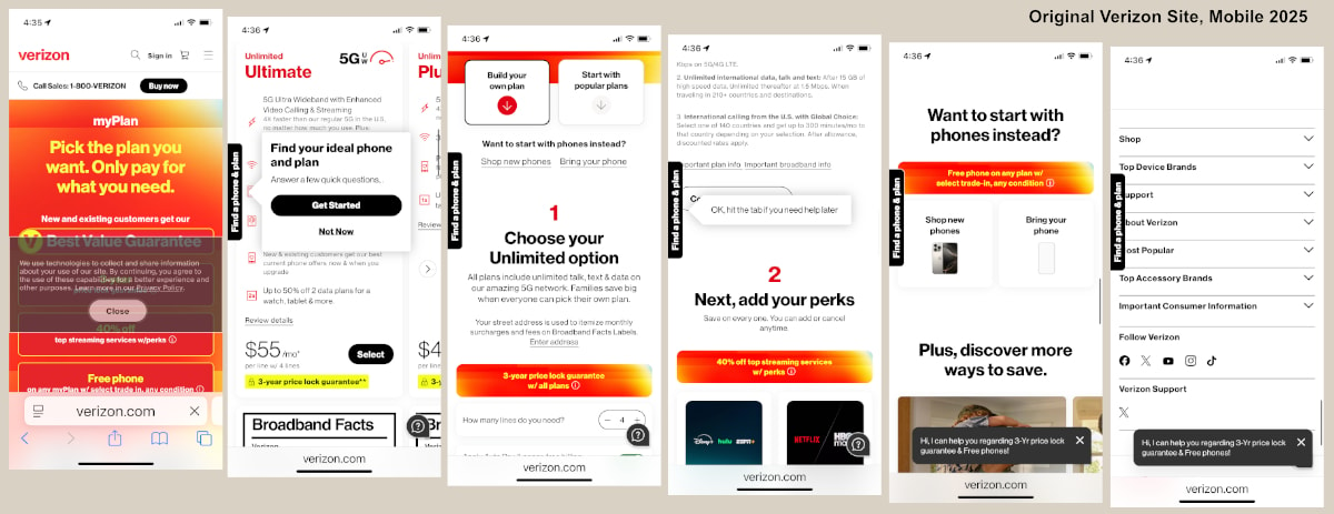
H1 myPlan The joined word is more suggestive of a drug name than a phone plan; too cold - “It’s up to you.” or deleted
H1 “Pick the plan you want. Only pay for what you need.” Wordy; is too direct “Customize the plan that you want.”
H2 “New and existing customers get a 3-year price lock guarantee.” There’s no need to mention a guarantee here; it’s a sellable feature DELETED
Badge “Best Value Guarantee” — repetitive, deleted. The word ‘value’ will be used elsewhere to suggest a return for the user
Category / Header s
“Home Internet” -> “Home”
“Shop” -> “Shop Devices”
Specific examples from the content audit:
Color
- Users reaching the https://www.verizon.com/plans/unlimited/ page face strong colors that may distract from the user’s journey (#E10014 Red, #F8FF3C Yellow, #FF281E Light Red) with large images and heroes.
- Color inconsistencies can be derived from branding color (ee001e) and other reds chosen.
- Colors may have cultural overlays that are welcome/unwelcome
Text
- H1 ext in yellow (#FF281E) is lower contrast than recommended by WCAG (3.72:1)
- Yellow text is hard to read in strong light settings
- Details in small print are intuitively distrusted
Sizing
- Button sizes vary from page standard sizing (300px)
- In mobile and desktop versions users are required to scroll for their first target - delayed target could result in engagement loss
- “Perks” icons have undersized text and oversized image space
Sources:
2 https://www.verizon.com/about/sites/default/files/240208_CONSUMER_CONNECTIONS.pdf
Learn more
Learn more
Neil Wetenkamp
Repositioning the Funnel, CDD
Content Design Document for the Verizon Project
Role: Content Designer
The project began with a real problem that faced the consumer website for verizon.com and its mobile plans page. At the time of this study, the problem still faces the company.
From the Content Design Document
Project: Verizon.com, mobile plans onboarding page
Created by: Neil Wetenkamp
- Introduction and Overview
Context:
Telecom giant Verizon relies on its website to bring in customers, and despite a steady influx of direct web traffic, has not captured a dominant place in the mobile plan market.
Problem to Solve:
Users are distracted by the current design, and already weary from competitive shopping, are easily frustrated by the interface. Low engagement and low click-through rate (CTR) results in lower sales. Of the top 3 telecom companies in the US, Verizon has the lowest traffic numbers despite comparable offerings.
Solution and Scope:
Improve content and interaction on the mobile plans page (https://www.verizon.com/plans/unlimited) to increase engagement and retention.
Content Goal:
Improve the content flow of the mobile plans page to increase accessibility, usability, and improve funneling of customer segments toward mobile plans.
An improved content flow will be followed by an adjustment in UX in separate documents.
2. Audience and User Needs
Target audience:
The audience for this content change are users seeking changes to mobile service. The demographics are wide (mass market), with larger segments in adults aged over 30.
An attached CX journey shows desired outcome for the content as well as pain points from user research.
Other considerations included:
- 32.7% of traffic to Verizon is from the desktop1
- Peer competitor ATT has 25% more web traffic
- Users are more likely to be older, near metros, and use their mobile devices for video content2
- High growth areas do not include California metros2
- Other users span domestic groups, in wide demographics
Content fits into the user experience in several ways. One, it leads customers toward choices with headers and CTAs. Two, it explains differences and benefits in captions and bullet points. Thirdly, it promotes a tone.
Scenario 1: Simplfied
Samantha Mochiwa is an urban office worker that has recently realized her son needs a phone too. Dealing with the unmistakable change in her son’s age, she wants a multi-line plan that saves the family money while offering high speed service. She finds the wordy advertising of some telecoms irritating, and is drawn to simpler, more straightforward content.
Scenario 2: Honesty
Louis Brand is a college student in a remote college, and needs good coverage. Though young, he’s seen how mobile plans can trick you with what they promise and wants an honest deal from a big provider with good coverage.
Edge Cases
Some edge cases to consider are cases where the user has limitations in language (alternate primary language, accessibility issues), or in environmental restrictions (limited time (work, school, schedule), light conditions, limited web access).
3. Content Strategy
Key messages and Tone:
Core messages should include the idea that Verizon is trustworthy, upfront, and full of value; users should see how they can save through the content.
Content types:
Microcopy (CTAs, buttons)
Help text (to guide choices)
Page copy
Bullet points
4. Design Rationale and Principles
Design principles:
Transparent as possible.
Describe in clear terms what costs are, where to save, or what benefits are
User-centric.
Users are busy people who need simplicity and can make their own decisions. Content should presume intelligence rather than frustration, with the voice and tone being helpful and empowering.
Trustworthy.
Pages and content stays consistent through pages, explain changes
Design rationale:
In user research and first hand accounts of the mobile plan shopping process, users expressed frustration with plan promises and the ‘legalese’ that came with it. A number of participants in the study also complained that the site felt like it was designed for other people, or that it was deceptive in guiding them to choices.
5. Content Structure and Design
Site Map:
This project is limited to a single contact point (page) along the customer journey.
Content Hierarchy:
Titles (H1): Label areas of focus, should be tied to user needs
Subtitles (H2): Explain, clarify, and lead users into the area
Headers (H3): Titles for decisions, considerations, or major themes
Subheaders (H4): Break longer sections into manageable chunks
Body Text: Clarifies and explains
Content Design, Examples:
UI Element | Before | Problem | After
H1 myPlan The joined word is more suggestive of a drug name than a phone plan; too cold - “It’s up to you.” or deleted
H1 “Pick the plan you want. Only pay for what you need.” Wordy; is too direct “Customize the plan that you want.”
H2 “New and existing customers get a 3-year price lock guarantee.” There’s no need to mention a guarantee here; it’s a sellable feature DELETED
Badge “Best Value Guarantee” — repetitive, deleted. The word ‘value’ will be used elsewhere to suggest a return for the user
Category / Header s
“Home Internet” -> “Home”
“Shop” -> “Shop Devices”
Specific examples from the content audit:
Color
- Users reaching the https://www.verizon.com/plans/unlimited/ page face strong colors that may distract from the user’s journey (#E10014 Red, #F8FF3C Yellow, #FF281E Light Red) with large images and heroes.
- Color inconsistencies can be derived from branding color (ee001e) and other reds chosen.
- Colors may have cultural overlays that are welcome/unwelcome
Text
- H1 ext in yellow (#FF281E) is lower contrast than recommended by WCAG (3.72:1)
- Yellow text is hard to read in strong light settings
- Details in small print are intuitively distrusted
Sizing
- Button sizes vary from page standard sizing (300px)
- In mobile and desktop versions users are required to scroll for their first target - delayed target could result in engagement loss
- “Perks” icons have undersized text and oversized image space
Sources:
2 https://www.verizon.com/about/sites/default/files/240208_CONSUMER_CONNECTIONS.pdf
Back to Case Study
Learn more